Why B2B Marketing Feels Random and How to Fix It
There’s a pattern we see in almost every B2B company we talk to.
3 min read
Scotty Smith
:
Updated on February 6, 2025

Your website is more than just a digital business card--it's your first opportunity to make an impression and capture attention. In today's fast-paced online world, an eye-catching website is essential for standing out and driving results.
Creating a website that truly wows visitors goes beyond aesthetics. It's about ensuring your site communicates professionalism, builds trust, and provides an outstanding user experience. Whether you're refreshing an existing site or starting from scratch, understanding what makes a website "eye-catching" is key to your success.
First impressions count, especially online. For SMB B2B businesses, your website isn't just a digital brochure--it's often your first opportunity to engage potential customers. A well-designed website communicates professionalism, builds trust, and drives conversions. But what makes a website "eye-catching" in 2025? It's more than just pretty pictures; it's about creating a seamless, engaging user experience.
Let's dive into the essential features that make modern websites stand out while staying functional and results-driven.

Building a visually appealing website requires attention to specific features that enhance both form and function. Here's what to prioritize:
Good design guides your visitor's eyes to the most important elements, like headlines, CTAs, and key imagery. Achieve this through:
Example: Consider Apple's website, which directs focus with clean fonts, minimal distractions, and clear CTAs.

White space (or negative space) is the unsung hero of modern website design. It provides breathing room for your content, making it easier for users to focus on key elements.
Tip: Think of white space as the frame for your content--it makes everything else shine.

With over half of web traffic coming from mobile devices, your site must look and work great on any screen size. Responsive design ensures:
Test your website's responsiveness by resizing your browser or using current tools like PageSpeed Insights or BrowserStack.

A slow website frustrates users and drives them away. Optimize performance with:
Stat: Sites that load in under 2 seconds enjoy a 15% higher conversion rate.

Visitors should never feel lost. Simple, clear navigation enhances usability and keeps users engaged longer. Best practices include:
Example: HubSpot's navigation menu is straightforward, making it easy for users to explore resources and tools.

Pictured Above: HubSpot's Home Page
Pictured Below: HubSpot's Home Page with the "Products" Tab Selected

Engage visitors and professional visuals that align with your brand. These include:
Need help with custom branding? Check out our Custom Branding Services.

Your website should reflect your brand identity at every touchpoint. This includes:
This not only reinforces brand recognition but also builds trust.

Your CTAs should guide users toward specific actions, like signing up, contacting your team, or making a purchase. Best practices include:

Build trust and credibility with social proof elements, including:

An eye-catching website should also be inclusive, ensuring everyone can navigate and engage with ease. Accessibility not only helps your audience but also boosts SEO and compliance.
A website that is easy for everyone to use also demonstrates your commitment to your audience.

Trust is key in B2B relationships. Protect your visitors and your brand by:

As technology evolves, so do user expectations. Features like dynamic visuals, animations, and bold, clean layouts can differentiate your site. But remember: simplicity and clarity always win.

Your website is your digital storefront--make it unforgettable. CycleWerx Marketing specializes in building stunning, functional websites that drive results. Let's create a design that not only looks great but also works for your business goals.
Learn more about our Web Development and Design Services, or contact us today to get started!
Subscribe to Our Monthly Newsletter
✅ HubSpot tips that drive action
✅ Marketing & sales strategies
✅ Insights for B2B SMB growth
Straight to your inbox.
No spam. No sales pitch. Just insights.

There’s a pattern we see in almost every B2B company we talk to.

There’s a problem most leadership teams can feel—but can’t always clearly define.

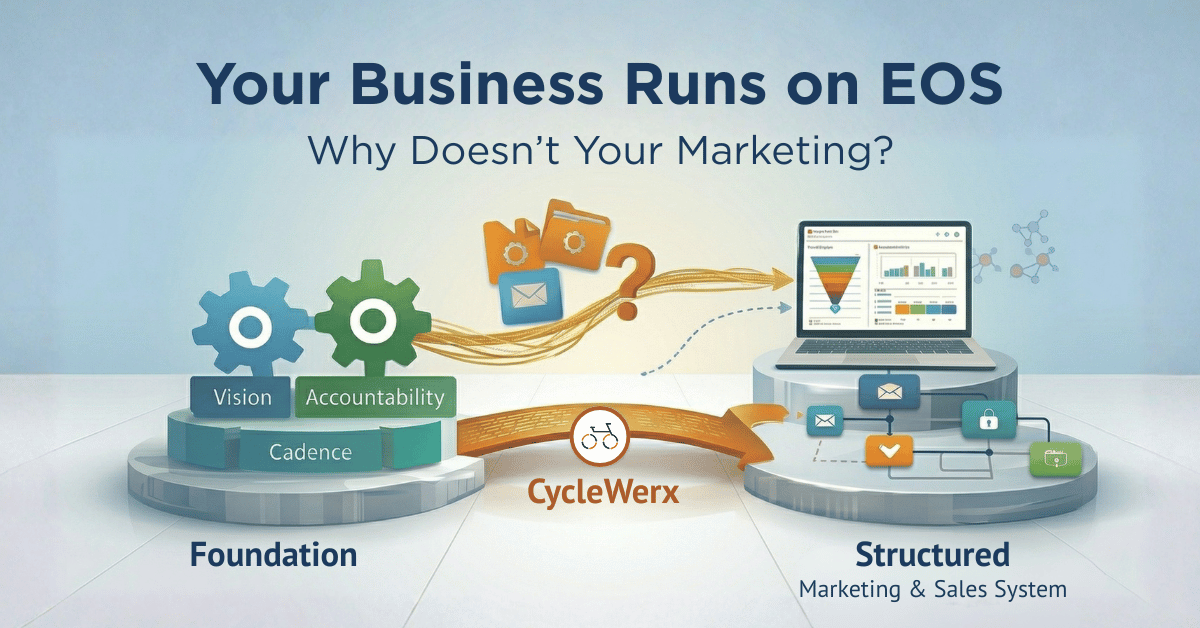
EOS (Entrepreneur Operating System) brings structure to a business.